|
|

Photo From: Tom Hemmick - Album: General
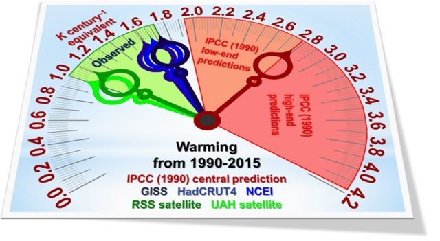
Description: This temperature clock shows the UN panel’s predictions as orange and red zones meeting at the red needle representing its prediction that there should be global warming equivalent to 2.8 degrees/century. Green needles represent the satellite data-sets, showing only a third of what the UN had predicted with “substantial confidence." Satellite data includes oceans and lands. Blue needles represent the warming reported by the surface temperature datasets, showing little more than half the UN prediction. All the data-sets, surface as well as satellite, show substantially less warming than UN predictions. Uploaded: 1/14/2017 by Tom Hemmick
Comments on this Image: (Be first to comment.)
You must be registered user and logged in to comment.
Login or Register and you will be returned to this image page.
Login or Register and you will be returned to this image page.


